Friday, December 16, 2011

Occupy what?


Here is another AdBusters Ad showing occupy Wall Street, and to bring a tent. This one ad brings much controversy so I thought it would be neat to show it.

AdBusters ad


I found this pretty funny because its an Adbusters picture of McDonald and grease is coming out of his mouth. I find this pretty funny!

Thursday, December 8, 2011

AdBusters

Trey Patterson                                                                                                             12/09/11
                                                Adbusters Magazine

Today I’m here to talk about the magazine called Adbusters. What is Adbusters? well it is a Canadian-based nonprofit, pro environment and anti consumerist organization founded in 1989 by Kalle Lasn and Bill Schmalzin Vancouver, British Columbia. Adbusters is self described as a gobal network of artists, writers, educators, pranksters and more who just wants to advance the new social activist movement to the younger generations. Adbuster has numerous international campaigns, including buy nothing day and Occupy Wall Street. Adbusters usually have a specialty of making spoofs of other extremely popular advertisements that we would see each and every day. Adbusters is a bi monthly magazine so every other month it comes out with two months posted on the cover of it. I believe that adbusters is worth subscribing to because of the variety of there magazine.

            Adbusters anti-advertises, has different campaigns that people could join in on and  just as the name implies, it puts you in mind of mad tv magazine how they spoof everything from tv shows to even advertisements and makes them look very stupid and funny to look at. Also Adbusters was a part of the highly talked about Digital Turnoff week which told people to spend seven days with any electronic devices, and the whole Occupy Wall Street. Adbusters promoted occupying on Wall Street as an ad of theirs urged people to bring a tent. I personally like how adbusters handled things because the company doesn’t care about what everyone thinks it cares about what everyone is going to think. Another funny thing about the wonderful Adbusters is the fact that even though the name has ad in it, adbusters is entirely ad free.

            Adbusters is open free to the people on their website as you can view their magazine to your hearts content. They use a variety of type fonts and sizes to explain their points to the consumers. This one ad that I was looking at said “Rick Perry for President” and under it said that he would put America back to work and under that in a tiny sized font they put “and make the airplanes run on time” which I found to be hilarious. This is the type of ad busting that adbusters do, it’s not too crude or too rash but a little criticism and funny add on’s to the ad to make it more funny in general. Also in the magazine they show a good amount of random pictures like a guy lying out in the street for no apparent reason and people walking past him. When I saw that I enjoyed the symbolism because it shows that there must be no jobs and it’s hard to make it out there in the world now and days. I enjoyed a picture like this over a make-up advertisement any day because to me it’s just to get people attention to buy a product rather than people seeing what’s going on around them in the world and the economy today.

            In my own little experience with magazines I used to subscribe to game informer, which is a videogame magazine that you could get and subscribe to from GameStop, I would enjoy and read every single month it came in. I would always see a game I would like and would want to buy it immediately, my next paycheck even, as long as I bought the game with good reviews. Well when I have gotten older II actually landed a job at GameStop and was told I had to sell the magazine. Come to find out the magazine is full of ads and games that people would want to by only just to put them into a huge circle of never ending game buying, so on my own I learned that game informer was a magazine for profit.

            Well with my viewing of adbusters self handily I recommend it a whole lot better than any other magazine people would see out there. Adbusters uses a unique way to keep people interested by using cool up to date graphic arts and cool stylish fonts. Adbusters is a magazine you could use to escape reality and notice what’s going on in it oddly enough. I belive that adbusters is highly underrated because of its bi-monthly rate and it’s no advertisements, because advertising other people’s ads help the magazine out a lot in the marketing process. All in all Adbusters is a very different and unique way of doing graphics, news, humor, education, and more in a simple real time magazine. I hope that people can see what I saw in this magazine and notice the variety in it.

Wednesday, November 30, 2011

Want one?


I thought this ad was pretty cool because it shows how cigarette ads were back in the day. I like how they try and trick people into believing how they can do good for you. I thought it was pretty eye catching because of the bright colors that lure you in.

Old School


I like this one because it shows a back in the day coca cola advertisement. I like how in this ad they used photography as well as painted the people. This style seemed popular during this period as all of the major ads seemed to be in this type of form. I thought that this was pretty catching considering how old it is.

Sunday, November 27, 2011

Black Ad


Thought this was pretty cool to put up considering black friday. It is very eye catching because of the tvs and the surprising prices.

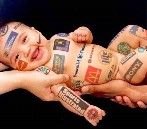
Baby logi?


I choose this one because it is very appealing as to how all the popular logos are on this baby. I thought this was pretty different so I decided to post it.

Friday, November 18, 2011

Animals > You


I found this on the internet and I thought it was cool. Apparently this sign at the zoo cares more about their animals than your safety. I really like this because it is eye catching and it makes you think. At first you wouldn't think anything of it but when you read on you notice what the sign is really saying.

Whats really there


I really like this ad because it really shows how food advertising works out there. The advertised food isn't even edible but it looks delicious. Usually when we go to a food place we don't notice the difference but its there. I think the advertising is very effective because if it wasn't people wouldn't even buy the advertised food let alone go somewhere where the reality picture is shown.

Wednesday, November 9, 2011


I like this literally, but I choose this because I like the fact that you can choose what you like on Facebook and the thumbs up sign is really attention grabbing. This is pretty effective to get people to like what they like literally!

Brisk Commerical


I like how brisk does their commercials, they really catch your eye because they animate bobble head dolls as celebrities and let them do the voice overs. Brisk is one of my favorite drinks as well so I thought of putting this up. here the link  http://www.youtube.com/watch?v=1DHo8fYFsd0

Tuesday, November 1, 2011

I like this one a lot because it's a flashy football picture done with Photoshop, it has many colors to catch anyone's attention. They used football players and actual footballs to express a theme of it in this picture. I find this very intriguing, and interesting and that is why I choose this.

.Navy.

I like this classic advertisement of an enlistment ad. It shows an old fashion picture and slogan to enlist in the navy. I like how they did the boarders and the anchors up top. This stood out to me because you really don't see any kind of enlistment ads like this anymore because their mostly on TV or doing it in person so I decided to do one.

Saturday, October 29, 2011

Yummy Pancakes


I really like this one because it is appealing, I like the way they advertised this showing off the different toppings with the whipped cream. This is pretty effective because they portrayed the pancakes perfectly. I really like this one, just saying

Sprite war


I really like this one because it shows a retro side of advertising soda. It is very effective as it catches your eye and has a slogan we can relate too. I choose this because it's retro and different from the regular  ads you see on sodas.

Tuesday, October 18, 2011

This is advertising from Gamestop this shows an email that you get once your members card expires. It can be a tad crude but the advertisement is pretty good because they give you reason why you should stay a member (although you can't see here). It caught my attention because I myself just renewed my member ship and also because I work there.

Walmart Christmas

This ad is a Walmart Christmas ad that shows the different deals they offer during the Christmas season. I like how they make the prices big and bright and the descriptions small. This is very effective advertisement because the prices catches peoples eyes and it is close to the holidays as well.

Tuesday, October 11, 2011

Bulls-eye

Typical Target ad, this is an online ad I came across and it entices people because of there different font sizes and their mention of free shipping. I like how they also used their mascot in their advertisement as well. This is a attention grabber but maybe not as much as some of my previous posts.

Japanese Ad

Japan does pretty good with their advertisements as you can see. i like how the man in the picture is really happy with his drink while there is focus lines around him as well. I chose this because it is different from what  we usually see from time to time so I thought that this would be neat because it stands out.

Sunday, October 9, 2011

Disney World [50]

I think this is brilliant advertisement first hand. The ad makes you really believe that there is magic. I chose this ad because it has been awhile before I actually went there. I really like how they show the fireworks in this piece because your eye seems to become binded by it. Overall this is really great work from those at Disney!

Thursday, October 6, 2011

IApplepod

Ok this is apples logo for the Ipod. I really like how they made the silhouette of a person and then made the ipod bright as day! This is very effective because it draws your attention straight to the ipod and makes you want to mimic the same movements as the silhouette. They do have many different ads like this but the reason why I choose this one is because it's probably one of the most well known ones.

Thursday, September 29, 2011

Joker

I really like the way they made this poster, they really amplified the character and made the poster mysterious. The dark knight was a wonderful movie and that also leads into why I choose this.

Jackpot

I like this one because it magnify's the shape and the sizes of the balls and the mega millions logo.
If I would look at this it would really intise me into thinking about doing the lottery. The used many colors and actual real life lotto balls to make this work!

Sunday, September 25, 2011

Song cover art!

Promotion poster for a song
I believe that this is pretty nice because it is shows the song name in the middle and the artists name on the right hand corner. I say this is a very effective piece.

Thursday, September 22, 2011

BK Value Menu


I like how they did this by advertising delicious food at the top and then showcasing that it is only a dollar each. The colors that they use really magnify the food at the top center. They also have their trademark logo in the bottom center. I think that this advertisement is very effective because it definitely caught my eye.

Thursday, September 15, 2011

Iron Man?


This was the promotional poster for the movie Iron Man. I thought it was cool how they grouped up all the main characters together vertically. I was drawn to this because I really liked this movie. It is in good quality and the title of it shows some really good work as well. I would like to do something like this one day.

Adult Swim Advertisement


This is a basic Adult Swim Advertisement on their dvd box set that I thought was neat. I saw this on a commercial one day and I was drawn to it because the actual network is the box's name. It uses different sized text that appeal to people and we did learn that in class. It's not really old but the quality seems good.